
2026
Government service delivery reimagined.
Note: This case study describes work performed in my professional role at the City of Bend. This site is not affiliated with or endorsed by the City.Role
UX Designer
Team Size
10
Platform
Web
Tool Stack
Miro / Optimal Workshop / Useberry/ CoPilot / Figma / WordPress
50% less navigation backtracking
Accessibility score: 81% → 92%
Opportunity
The City of Bend website receives roughly 1.6 million views per year and serves as the primary source for essential city services—yet it wasn't meeting community needs. After years of advocacy, user research, and strategic alignment with senior leadership, my team and I convinced the organization to leave its legacy govtech CMS and partner with a design agency to build a municipal website unlike any other.
Research & Discovery
As part of an early-stage redesign effort, we partnered with research firm Sitecrafting to understand how the Bend community used the website, which tasks they came to complete, and where improvements were needed. Our research included stakeholder workshops, Google Analytics analysis, on-site feedback collection, a community survey, top-task analysis, and tree testing.
What we heard
The data had been hinting at it for a while, but our research made it painfully clear: people were wrestling with the site on the most basic, everyday tasks. Not just the weird edge cases. Through hundreds of submissions via the on-site feedback collector and community survey, we found that:
Permitting was confusing.
Paying water bills online was difficult.
The search functionality needed improvement.
The community had lots of questions about parking.
In general, the website is hard to navigate, and finding information is difficult.
We've since made IA and content updates to address the first three issues—permitting, parking, and water bill payment—but our aging CMS severely limited our ability to improve search and make necessary improvements to the sitemap and overall IA.
Implementation
Through a strategic partnership with Moxie Sozo—an independent branding and design agency and winner of Ad Age's 2025 Small Agency of the Year (Silver)—we positioned ourselves to launch a completely reimagined website for the City.
Content optimized for clarity and accessibility.
In addition to ensuring the site meets or exceeds WCAG 2.1 AA standards, we're systematically auditing content—removing unnecessary pages, consolidating where it makes sense, and building new pages where context was missing. We're rewriting copy at an 8th-grade reading level, which improves comprehension for most users and makes automated translation tools and screen readers far more effective. We're eliminating jargon, spelling out acronyms, and breaking up dense text blocks.
Audience-centered, data-informed information architecture.
Users no longer need to know which department or division provides a service. Instead, services are organized to align with user mental models.
To develop a task-based IA, I reviewed the top tasks identified by Sitecrafting, the past year's site analytics, and the City's current navigation. Prioritizing the top-task analysis and analytics data, I used AI-assisted ideation to develop a task-oriented navigation structure aligned with user mental models.
Through many iterations and stakeholder meetings, we identified three possible directions for a new sitemap.
From there, we conducted tree testing with a sample size of over 200 to identify which to proceed with, analyzed the data, and further refined the sitemap with the help of my AI assistant.
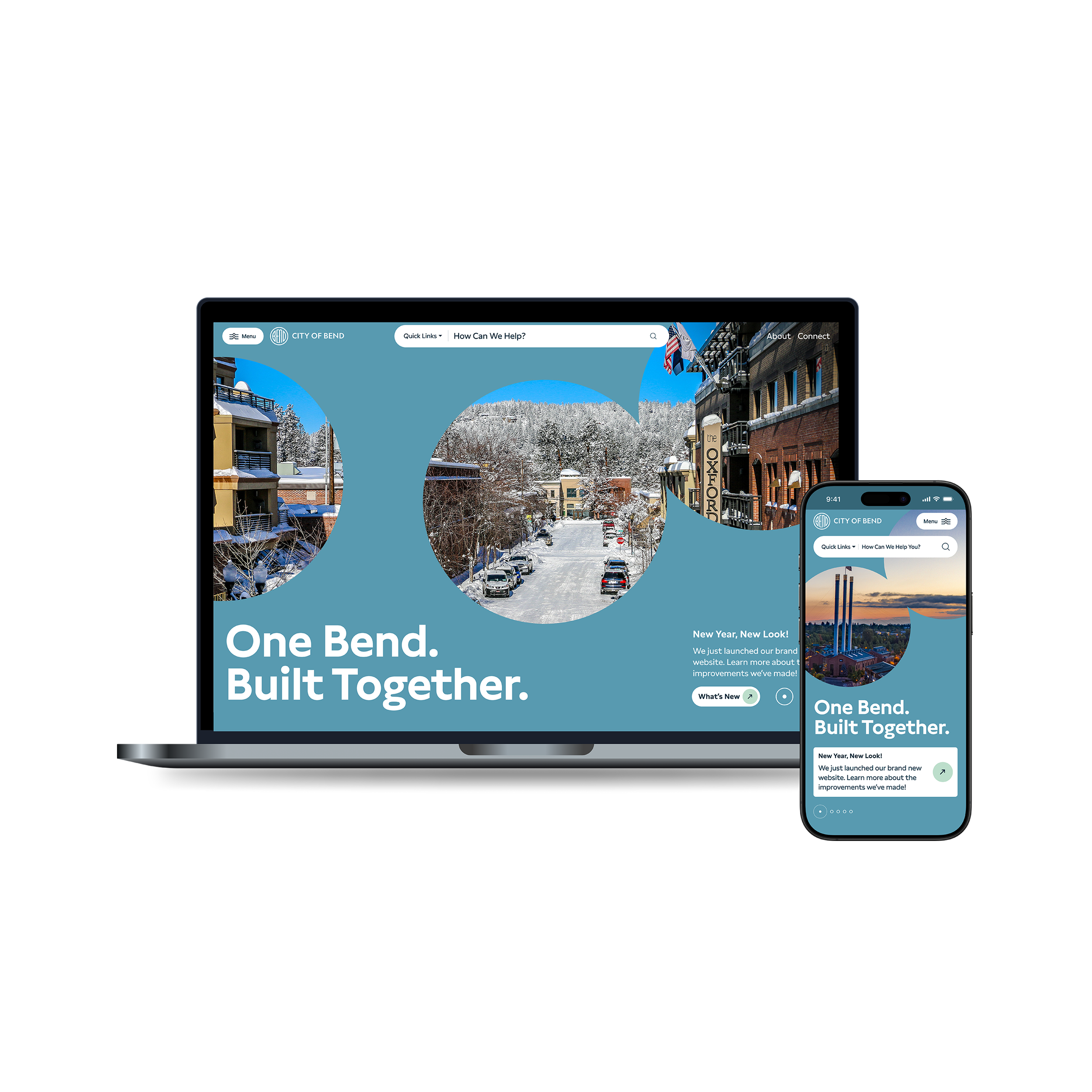
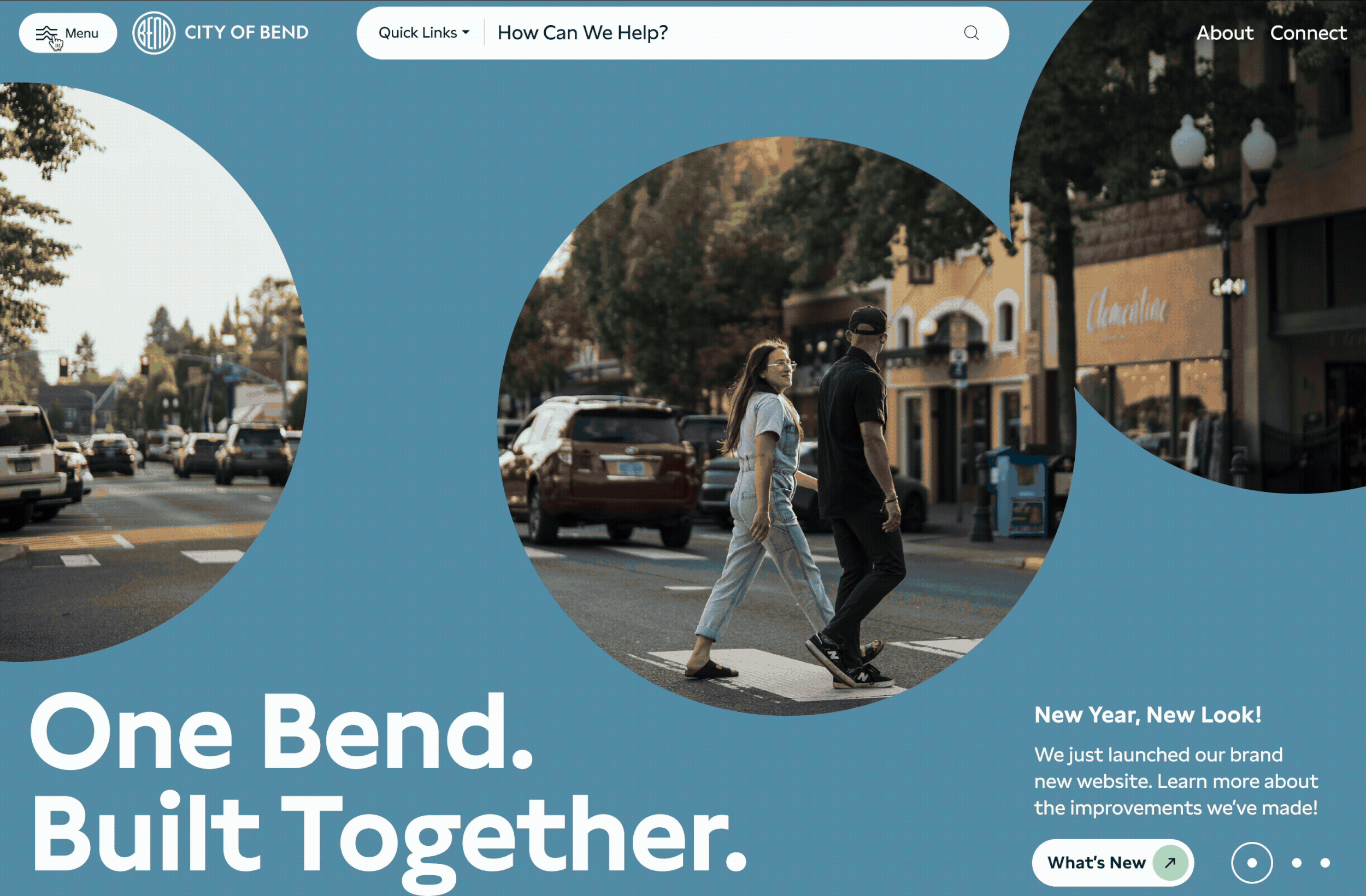
User-first, clean, modern design.
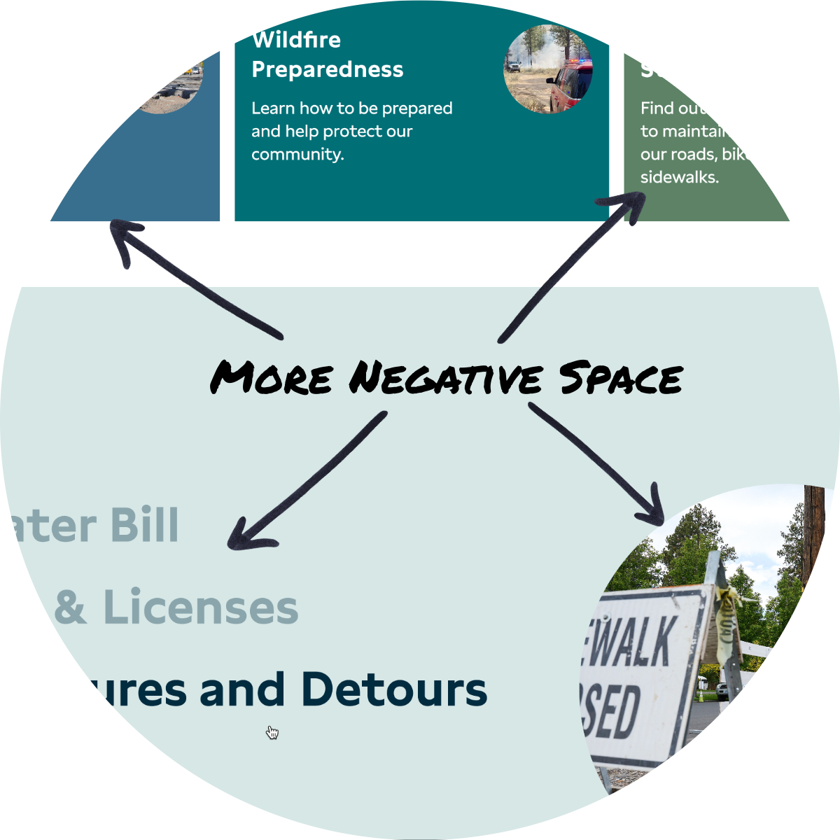
Increased negative space allows content to breathe, making it easier for users to focus and process information.
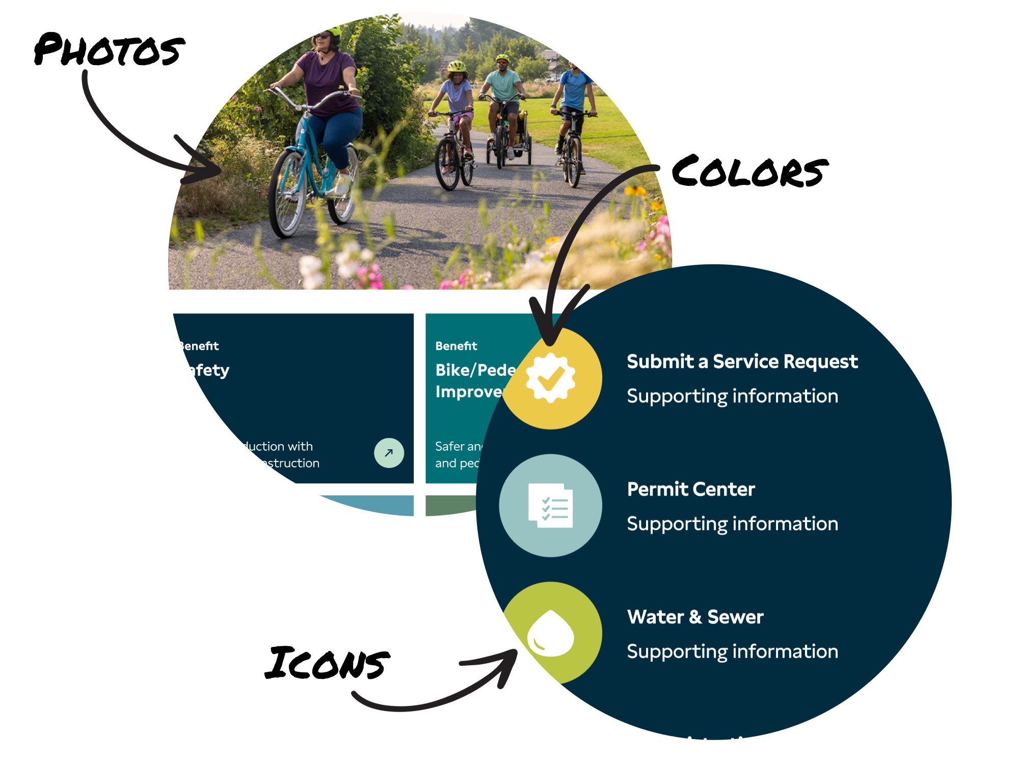
Enhanced visual design through a more vibrant color palette, engaging graphic elements, and stronger photography—particularly featuring community members and City staff in action. This adds context, increases engagement, and breaks up text to improve comprehension.
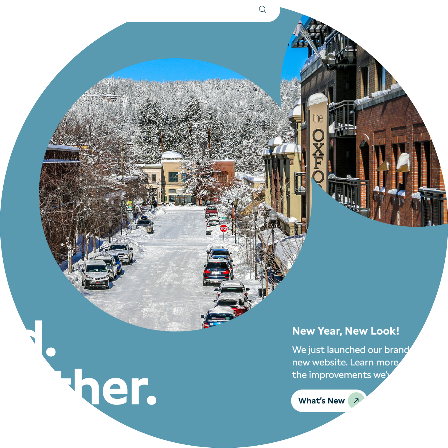
Circle motif representing unity and connectedness, drawn from the Bend logo and integrated throughout the site design.
Navigation
Perhaps the most significant update is the vastly improved top navigation bar.
The hamburger menu reduces page clutter by collapsing all menu items under one button. On the current site, the top of every page is dominated by unrelated links.
Prominent, persistent search bar. Given the critical role of search in findability, we made the search bar always accessible and implemented a significantly improved search tool.
In-page navigation is prominently displayed, allowing users to jump directly to specific sections of content.
The new menu's three-panel structure allows for more menu options than the current site supports, enabling users to navigate three levels deep from any page without overwhelming them.
3-Panel Hamburger Menu
“Services" as the first menu item emphasizes the site's service-oriented focus.
Explainer text below menu headings provides additional context.
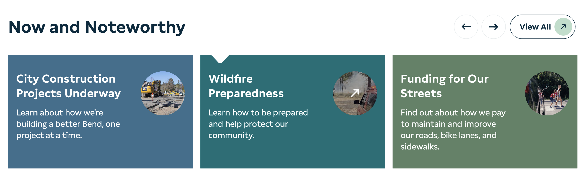
Now and Noteworthy
Directly below the hero section on the homepage, this module highlights the City's top priorities and projects the community cares about—think trending. Content includes construction projects, wildfire preparedness information, and other timely updates.
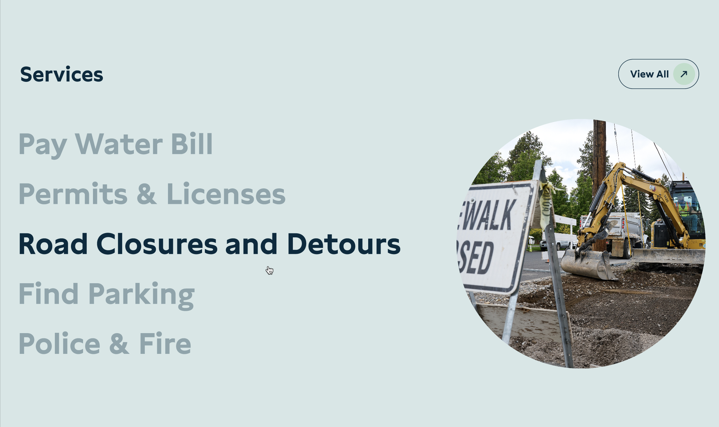
Services
Next on the homepage is a clear, prominent Services section, offering an easy way for visitors to access the top services identified through user research.
Results
Launched January 26, 2026, the redesigned site showed measurable improvements within the first month. The following data compares February 2025 (old site) to February 2026 (new site).
Navigation Efficiency
One of the clearest signals that the new information architecture is working: users are finding what they need without backtracking. We measured repeat visits to the same page within a single session—a sign that someone navigated away, couldn't find what they needed, and returned. Across key service areas, these dropped significantly:
Why this matters: These were among the highest-traffic, highest-frustration service areas identified in our original research. The task-based IA and improved navigation structure are directly reducing the friction residents experienced on the old site.
Accessibility
WCAG 2.1 A/AA Conformance Score*: 81% to 92%.
*via Siteimprove
Content is being rewritten to an 8th-grade reading level, improving comprehension for most users and making automated translation tools and screen readers more effective. We began implementing WCAG standards aligned with Section 508 in 2017, years before the DOJ prioritized municipal web accessibility.
What We're Tracking Next
These early results are promising, but we're continuing to measure:
Task completion rates for top services (permits, water bills, parking)
Search usage patterns (a drop in search reliance would further validate the new IA)
Mobile vs. desktop task efficiency
Permit counter visit volume (are we successfully deflecting in-person visits?)