2026 Snapshots

Data visualization work + adjacent experience.

Tableau explorations, PowerBI & GIS collaboration, and infographics.

Explorations in Tableau

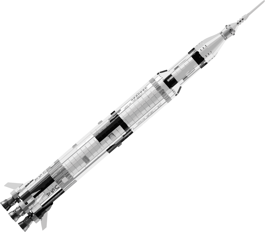
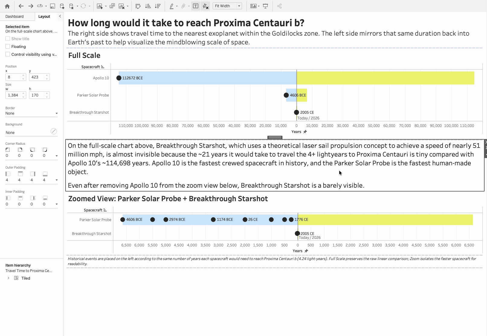
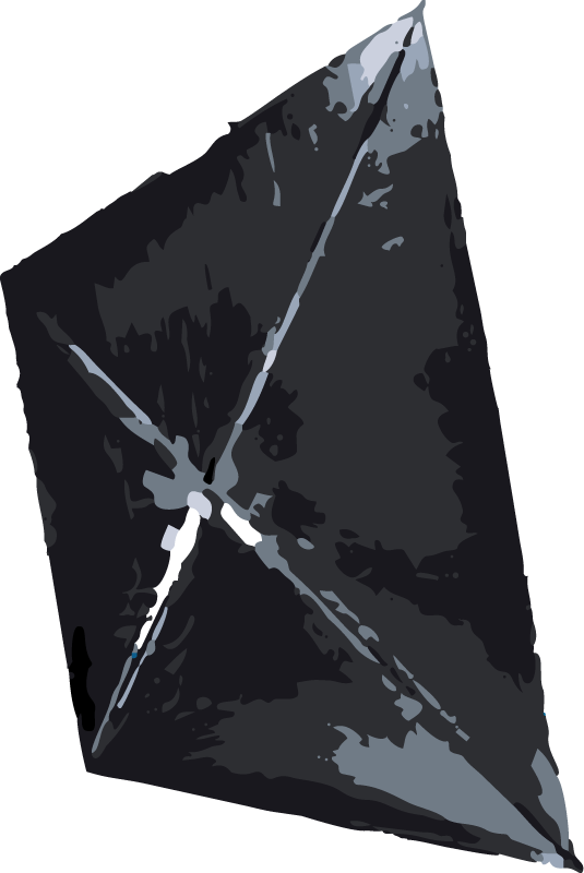
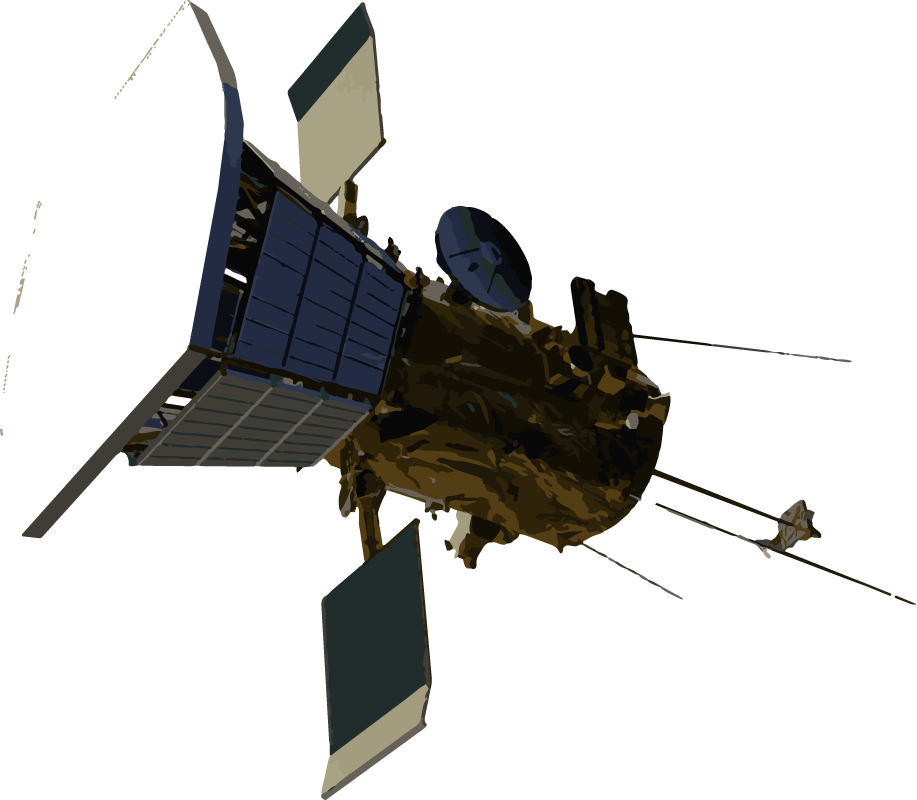
SPACE-TIME VISUALIZATION

Cosmic Mirror

This concept maps the mind-blowing scale of space to historical time on earth.

I compare three spacecrafts to visualize how long it would take each of them to reach the nearest exoplanet within the so-called “Goldilocks Zone”.

The Atlas-5 rocket.
Chart displaying travel time to reach Proxima Centauri b. The full-scale view shows spacecraft and probe travel durations from Apollo 10, Parker Solar Probe, and Breakthrough Starshot, with a zoomed-in view focusing on Parker Solar Probe and Breakthrough Starshot. Data highlights Apollo 10's rapid travel time and the near-invisibility of Breakthrough Starshot due to high speed.
Illustration of the Breakthrough Starshot interstellar craft concept.
Rendering of the Parker Solar Probe.


Diving into the Numbers Post-2020

I built this visualization to explore how permit volume has changed over time. Bend saw a huge increase in permit applications since 2020.

PERMITTING DATA VISUALIZATIONS

INFORMATION DESIGN

Infographics

A selection of infographics I've designed for the City of Bend. Each one required translating complex or dense information into an image a non-expert audience could absorb quickly.

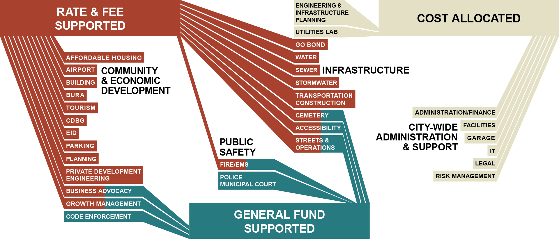
HOW DEPARTMENTS ARE FUNDED
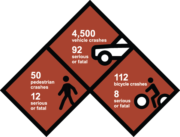
A funnel chart visualizing budget allocation for a city project, showing categories like 'Rate & Fee Supported,' 'General Fund Supported,' and 'Cost Allocated,' with specific allocations for services such as affordable housing, airport, police, fire, utilities, and infrastructure.

CRASH DATA

Infographic showing statistical data on vehicle, pedestrian, and bicycle crashes, with counts of crashes and fatalities.
An illustration of a road with a dashed dividing line, a crash or explosion symbol on the left, and a T-intersection in the middle.

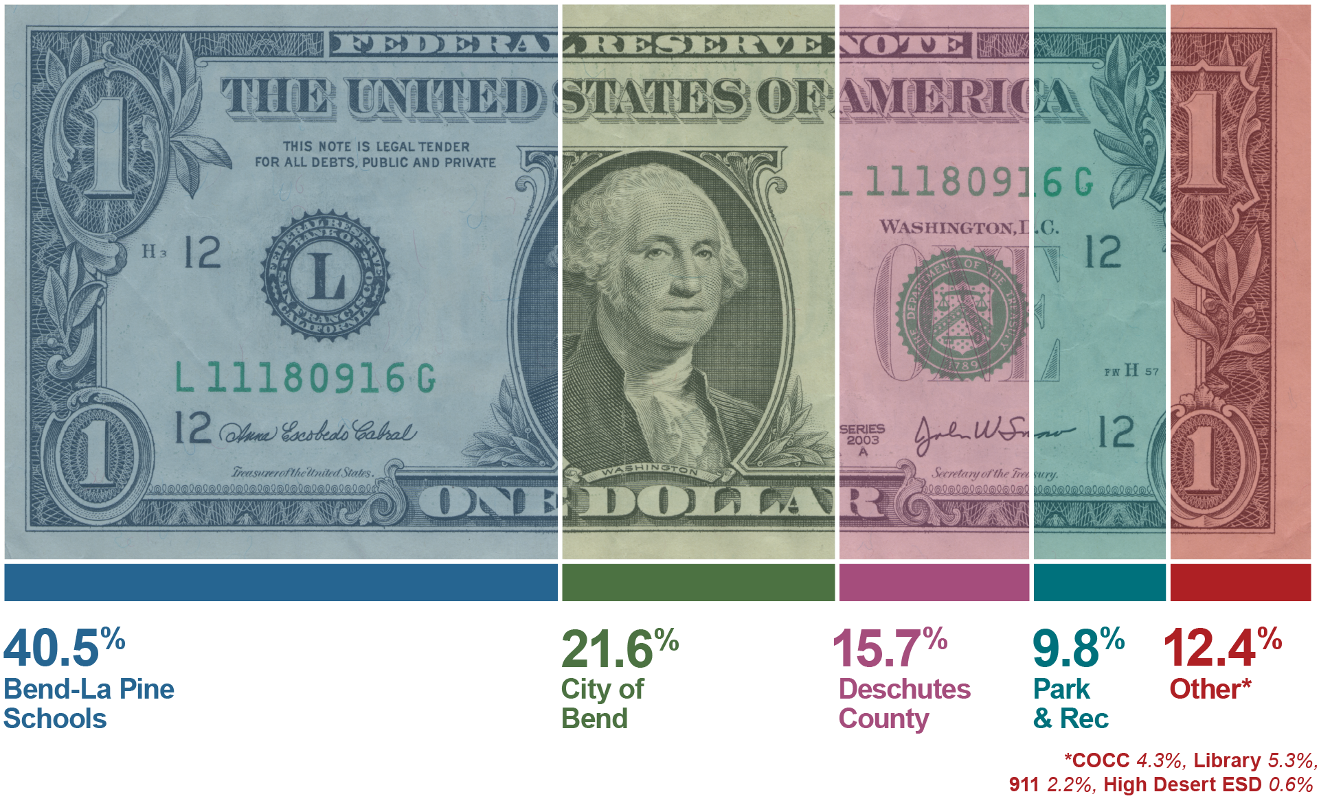
PROPERTY TAX BREAKDOWN

Infographic showing how a dollar bill is divided among the various taxing agencies in Bend, Oregon.

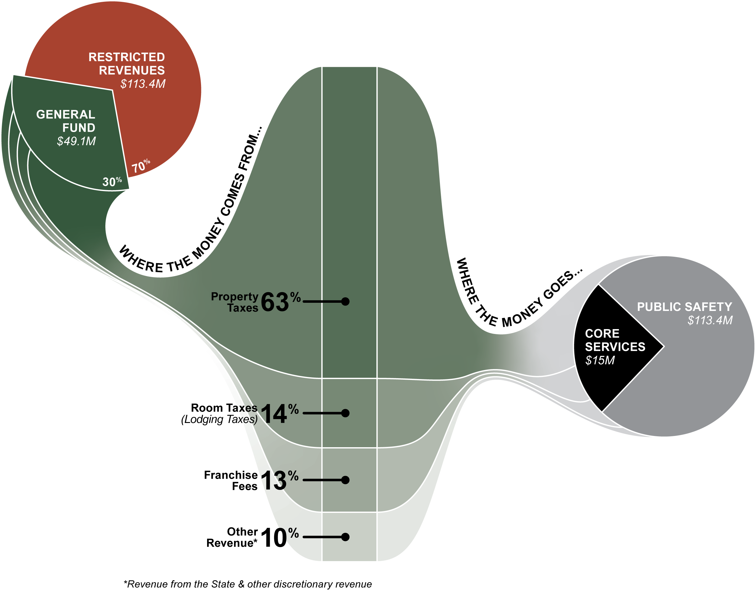
WHERE FUNDS COME FROM
+ WHAT THEY PAY FOR

Flowchart illustrating how property taxes are allocated, showing that 63% goes to property taxes, 14% to other taxes, 13% to another category, and 0% elsewhere. Additional sections show sources of revenue, including restricted revenues and general fund, with respective dollar amounts. Public safety and core services are funded with specific amounts indicated.

GIS COLLABORATION

Downtown Parking Map (In Progress)

Parking management dashboard with interactive map and statistics, including parking space counts, bike racks, street parking rules, and various parking area categories, with annotations for adjustments and feature counts.

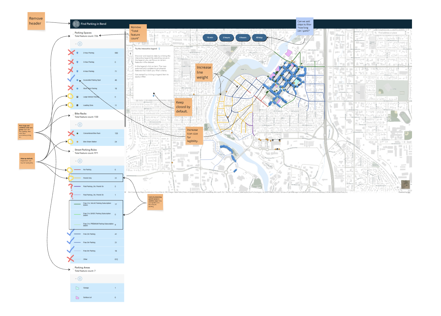
An ongoing project to simplify an existing parking map that suffers from information overload—duplicate data layers, no visual hierarchy, and too much competing for attention at once.

I'm currently working through improvement recommendations focused on clarity and usability.